Indicators, the cornerstone of the dashboard
Dashboards may contain different types of indicators. However, always remember that an indicator must be exploitable, i.e. enabling a decision to be made or an action to be carried out.
- Performance indicators:
- Performance measurement involves assessing the effectiveness of a process or activity in relation to predefined objectives. It involves quantifying and monitoring the achievement of set objectives.
- Example: For an online sales company, performance measurement might involve assessing whether it is achieving its monthly sales targets. If the objective is to achieve 1 million dollars in sales per month, performance will be measured according to whether or not this objective is achieved.
- Efficiency indicators:
- Measuring efficiency involves assessing how resources, such as time, money or manpower, are used to accomplish a specific task or process.
- Example: In the context of supply chain management for an online retailer, measuring efficiency might mean assessing how much time and resources are required to process an order from the moment it is placed online until it is delivered to the customer.
- Guidance indicators:
- They provide an understanding of the overall context in which an activity or process takes place. Their purpose is to provide a general perspective for a better understanding of the situation. Guidance indicators, used more in operational dashboards, provide factual information over a given period to enable a user to define the actions to be taken.
- Example: For an online sales company, it is essential to understand why its conversion rate has fallen. This would involve describing the profile and behaviour of visitors to the sales portal.
- Trend indicators:
- Trend indicators identify emerging trends or potential future changes. The aim is to predict what might happen in order to make informed decisions.
- Example: For an online retailer, anticipation might involve analysing historical sales data to predict periods of high demand, such as the festive season, so that stocks and logistical resources can be better planned in advance. This makes it possible to anticipate future needs.
Note that indicators may also be financial or non-financial (quality, human or technical resources, etc.).
From the user story to the indicator
The creation of user stories, compiled in a document called the Product Backlog, is a method used to formalize the requirements and constraints for the development of a project. This method originates from the agile project management field in which the drafting of a specification is not always required, or will occur after the drafting of a project specification (which defines a scope) in order to clearly express the business needs.
In business intelligence, user stories are created to ensure a sound understanding of the indicators required by decision-makers, and of the nature of the decisions that need to be made in order to produce dashboards that best meet the needs.
The creation of user stories is described on the Writing a user story page.
Structure of a user story
A user story has the following structure:
As a [type-user], I need a [functionality] in order to [purpose].
where:
- type-user: must correspond to a clearly identifiable role / function (marketing manager, human resources director, sales manager, etc.). The description of the type-user must be consistent with the specified functionality and the nature of the decisions likely to be made.
- functionality: this is a need in terms of the analysis of a phenomenon or the analysis of the performance of a process (customer satisfaction, sales performance, etc.). If an indicator is specified (number of complaints, turnover, etc.) it must not be presented in isolation; it must be a further detail that complements the need.
- purpose: this consists in explaining how the stipulated need helps the type-user to make decisions in order to attain the objectives set by the company in its strategy.
Method
The user stories enabled you to establish a dialogue with your customer and to express their needs clearly in natural language. The indicators that you are going to build must allow you to respond to the functionalities expected in the user stories.
Your aim now is to build a table linking the different user stories to the indicators and any target objectives expressed by the user. You may have to cut out the original user stories that are too complex.
Consider the nature of the dashboard you are going to produce in order to select appropriate types of indicators. An executive director might need steering indicators, while a department head might be interested in performance or efficiency indicators for the same expressed functionality.
- The purpose must enable the identification of the actions or decisions that can be implemented after analyzing the dashboard.
- The functionalities of our user stories must now be broken down into indicators:
- Keep the purpose in mind.
- Review each of the different types of indicators and ask yourself whether they are relevant or irrelevant to your context.
- State whether a numeric objective can be specified, as is the case for certain indicators (management, performance, efficiency, etc.).
If the client has made a point of defining a certain number of indicators (which you should have noted in an appendix), you must now reconsider them in light of the identified purposes and functionalities. You can then add the indicator to the relevant place, improve it, or even discard it.
Whatever the circumstances, you must justify your choices and convince the client that your decision is well founded. If your decision is insufficiently substantiated, the client could require you to create its own indicator in opposition to the design team’s choices (which would augur badly for the advancement of the project).
Example
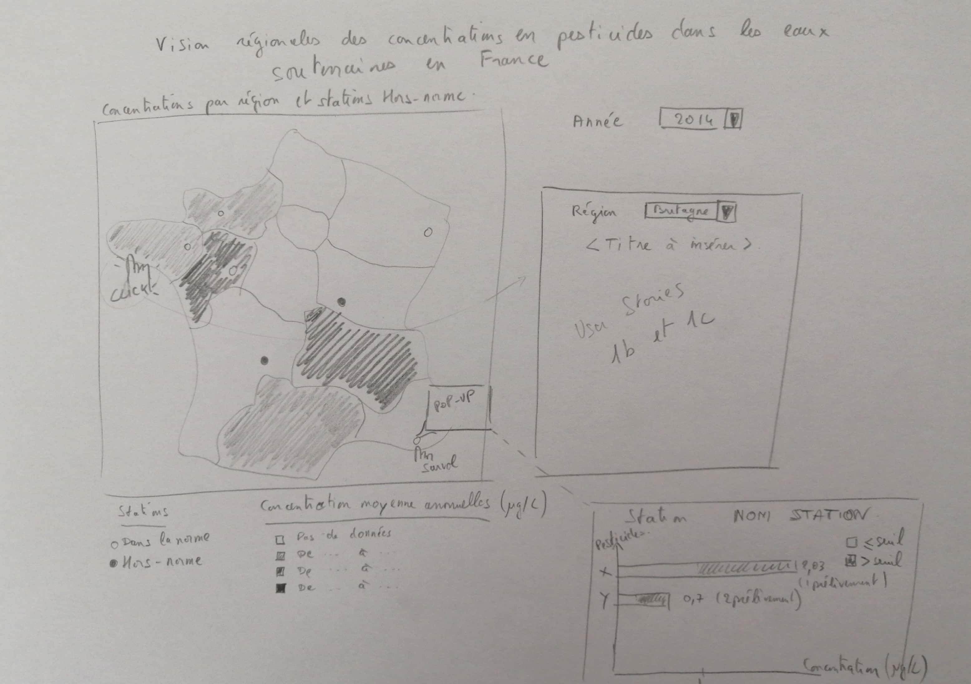
Let’s take the context of the Designing a dashboard activity (Tableau Desktop or Power BI version). Let’s consider the following user story:
As a member of the Assemblée Permanente des Présidents des Commissions locales de l’eau de Bretagne (APPCB - permanent assembly of presidents of water boards in Brittany), I need to view the pesticide levels for each French region and identify the non-compliant water treatment plants in order to evaluate the effectiveness of the policies implemented and be able to compare their results from one region to another.
Based on this user story, you must work on clarifying the functionality by precisely defining the indicators useful to the decision-maker. To do this, you must take into account the purpose expressed, which has an impact on the choice of indicators.
| Activity | Purpose | Functionality | Indicator | Targeted numeric objective (if applicable) |
|---|---|---|---|---|
| Management of pollution levels | Evaluate the effectiveness of the implemented policies | View pesticide levels in the regions | Annual average concentration (all pesticides combined) per region | < 0.1µg/L |
| Identify non-compliant plants | Boolean specifying whether there is, for the station in a given year, at least one pesticide whose annual average concentration exceeds the standard |
For a given sprint, the analysis of the user stories to be implemented should lead to the production of a complete table, which can then be used as the basis for a mock-up of the dashboard, as shown below:
- The first stage is to define a visual representation that is adapted to each indicator.
- The second phase is to produce an overall mock-up of the dashboard based on design principles which are consistent with your client’s business practices.