The different types of dashboards
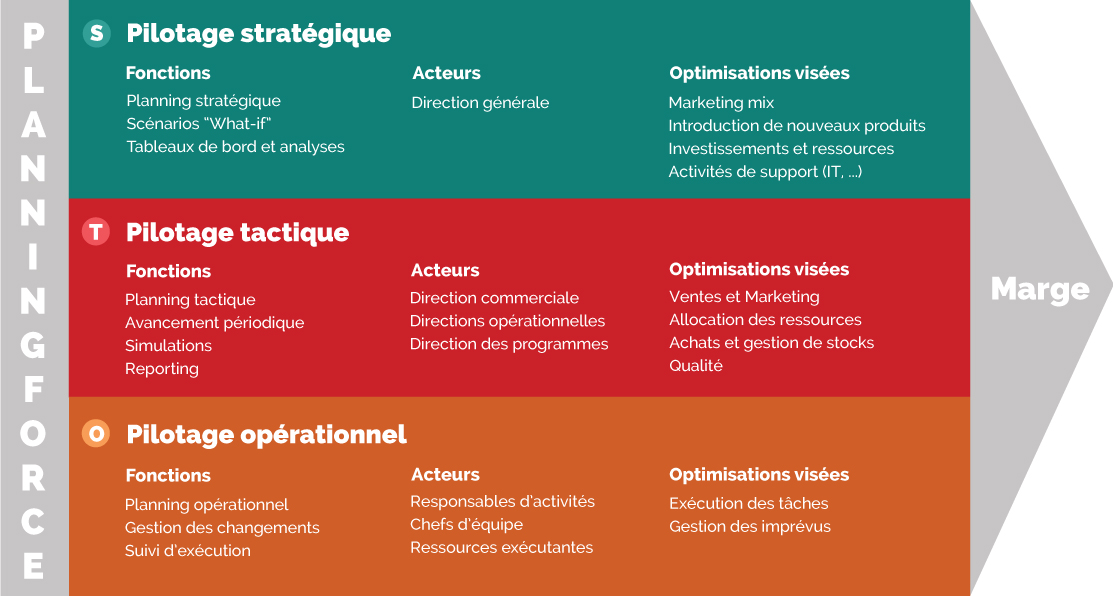
The contents and uses of dashboards differ according to the final user. In companies, three different levels of usage can be identified:
- Strategic dashboards or balanced scorecards, intended for executives, which provide an overview of the company’s performance in relation to the attainment of strategic objectives.
- Tactical or management dashboards, intended for managers of teams and departments, which provide an insight into the performance of their actions. They should assist with daily monitoring or help to develop an understanding of a specific event.
- Operational dashboards, intended for different business activities and designed to measure the performance of a specific action, campaign or process.
Creating a dashboard
Using a business-oriented approach to facilitate fluid and coherent analysis
Dashboards should be designed to help decision-makers analyze a situation, and to assist them with their decision-making. To this end, they should be able to analyze the dashboard quickly and fluidly. This will enable them to focus on their business activity rather than on trying to understand the data. You must therefore:
- Respect the reasoning process adopted by your decision-makers. If they habitually operate in a certain manner, refrain from bothering them with a possibly innovative solution which they could find frustrating.
- Conform to the specific business terminology and never leave your users with ambiguous or meaningless indicators.
Dashboards can therefore be designed in different ways:
- Per group of similar indicators: either because they are based on the same metric (e.g. measurements of turnover according to different data dimensions), or because they analyze a single object (acquisition of new clients, etc.)
- Per degree of detail: to enable users to understand the global context before gradually delving into the specific details. For example, a national overview before proceeding into the regional and then local levels.
- Per causal link, by presenting specific indicators (e.g. response time, technical quality of the response) leading to a more composite indicator (customer satisfaction).
Using interactivity wisely
You must make it possible to access any information deemed relevant for decision-making and, if necessary, any relevant characteristics of this information, possibly via interactivity. For example, you could enable interactive data browsing when not all of this data can be viewed simultaneously: interaction in order to change to a different view, a sub-view, or to change the perspective on data.
But be careful! Don’t give so much choice on filtering and selection that users can no longer work out how to start the analysis. Introduce interactivity where it can be beneficial: a mouse-over tooltip, an intuitive filter based on business categories, etc.
Never force users to interact constantly with your dashboard in order to develop an overview: for example, adding a filter for each year when your user wants to compare performance over the last three years would be the worst thing you could do.
Further reading on this topic
These different resources present best practices for the visual representation of dashboards:
Reading Top 5 best practices for creating effective dashboards. Tableau.
Reading The Data Visualization Design Process: A Step-by-Step Guide for Beginners. Ilan Hertz.
Reading The Wall Street Journal Guide to Information Graphics – The Dos and Don′ts of Presenting Data, Facts, and Figures. Dona Wong. Chapter 2, pages 49-91.