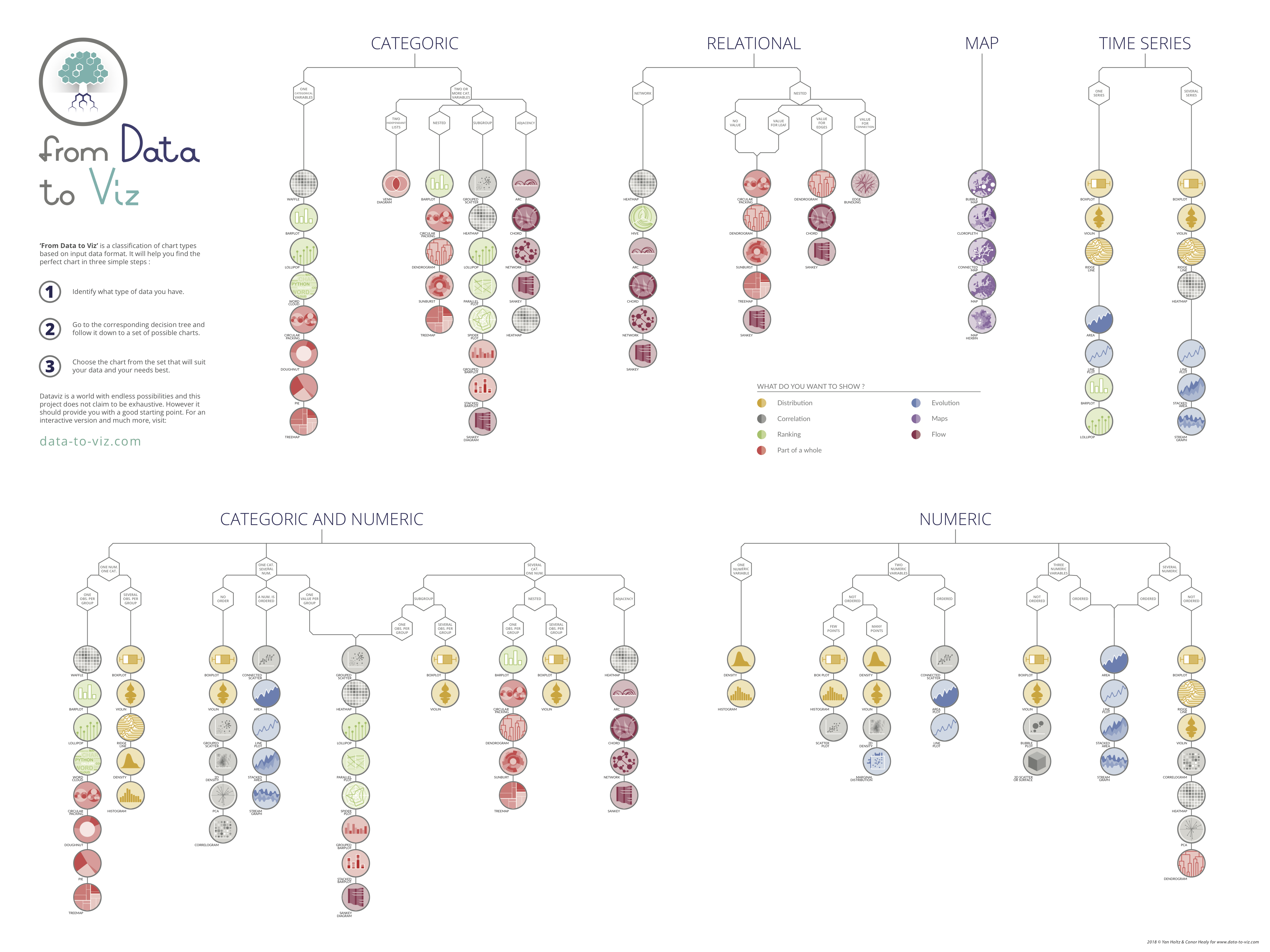
Choosing the best visual representation for an indicator
Your indicators can be presented in many different ways, some of which are much better than others! You can use this interactive tool to examine possible solutions according to the type of indicator to be displayed.
- Use visuals requiring the comparison of surface areas or angles: pie charts, donuts, treemaps, etc.
- Use a pie chart to display values whose total is below 100% or when certain values are negative.
- Use a bar chart to display values that vary naturally over time: opt for a curve!
- If you have several indicators with a single temporal axis, align them vertically!
- Always use the same color to represent the same measure or the same category in all your dashboards
- The keys must be clear and easy to read: in general, position them above and to the left of your visual. It must be obvious whether they relate to a specific representation or to the entire dashboard.
Reading Choosing an effective visual, by Laurent Brisson and Cécile Bothorel (IMT Atlantique), https://formations.imt-atlantique.fr/data_storytelling/visual_concept.html.
Eliminating clutter
We use “clutter” in this context to describe the visual overload generated by the representation of an indicator, which imposes a cognitive load. The visuals used in your dashboard must be sufficiently intuitive and understandable at a glance to enable the decision-maker to focus on the actions to be carried out and the decisions to be made.
Our short-term memory is only capable of processing three or four items of information at any given time (Source): it is therefore important to bear this in mind when designing your dashboard.
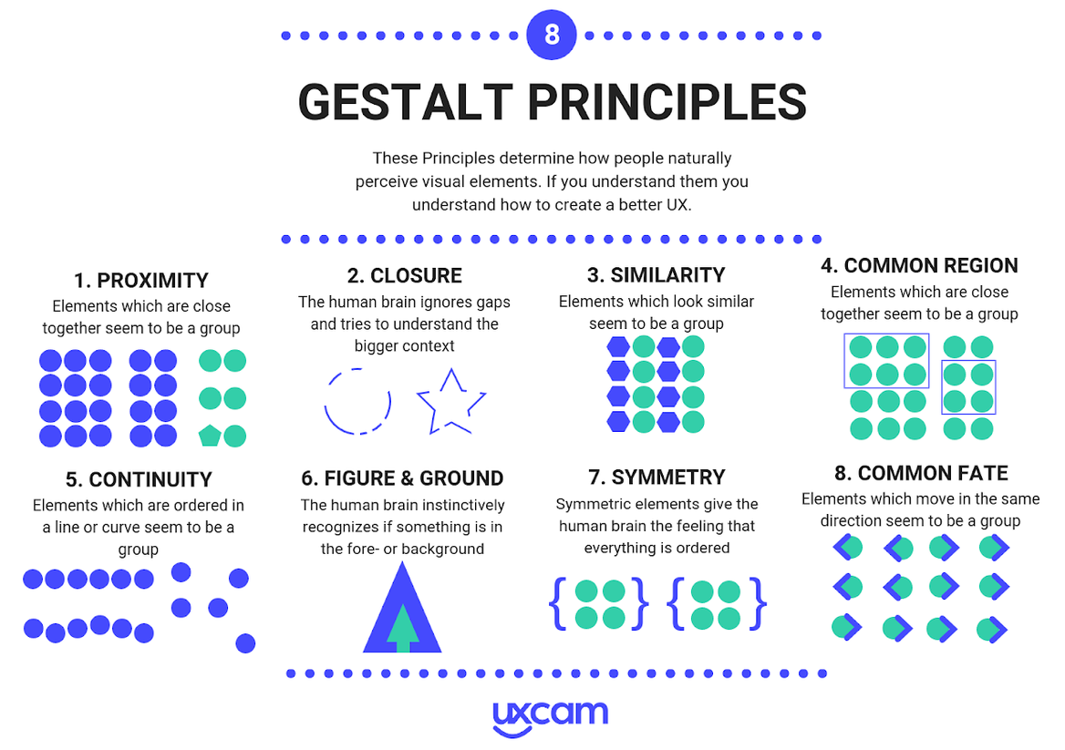
However, certain techniques can be used to trigger the automatic processing of information by the visual system in human beings, which can eliminate the need for conscious processing and enable a “block” of information to be treated as a single information item to be consciously processed. These techniques are based on Gestalt principles.
- Use a histogram to display categorical data (opt for a horizontal bar chart)
- Create a spaghetti plot: i.e. display 5 or 6 curves on a single graph
- Include several vertical axes (and therefore different units) on the same diagram
- Sort the data in your horizontal bar chart in ascending or descending order
- Use horizontal bar charts for any comparisons of categories
- Always insert the same type of texts in the same place and in the same format for each visual: e.g. position the title of a graphic, in Arial 12 pt bold, on the top left
Reading Clutter is your enemy!, by Laurent Brisson and Cécile Bothorel (IMT Atlantique), https://formations.imt-atlantique.fr/data_storytelling/clutter_concept.html.
Highlighting
The aim of highlighting is to focus users’ attention on where it is required to enable them to process the information more quickly. There are three ways to do this:
- choose the right color: choose few colors, give them meaning and leave empty space around them to highlight these colors
- choose the right size: beware of choosing the wrong sizes for visuals; however, titles, keys and units must stand out clearly!
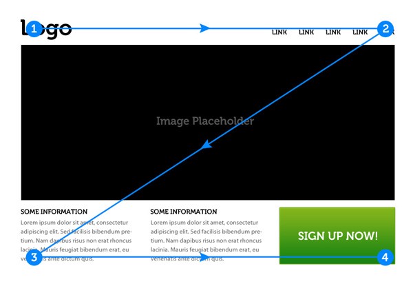
- choose the right position: remain consistent with positions; place important elements on the top left-hand side and consider using the Z-shaped pattern (see image below)
- Using too many colors or non-intuitive colors (blue for negative, purple for positive, etc.)
- Using size inappropriately and thereby masking information in certain cases
- Each diagram should have a clear title above the indicators in question and/or state the purpose of their use
- Each X axis and Y axis should have a title and their units should be labeled
- In the title of the graph, the color of the expression concerning the indicator should be the same as in the visual just below
Reading Focus your audience's attention, by Laurent Brisson and Cécile Bothorel (IMT Atlantique), https://formations.imt-atlantique.fr/data_storytelling/focus_concept.html.
Reading Z-Shaped Pattern For Reading Web Content , by Nick Babich, http://babich.biz/zpattern/, Retrieved on April 3, 2020.