Objective
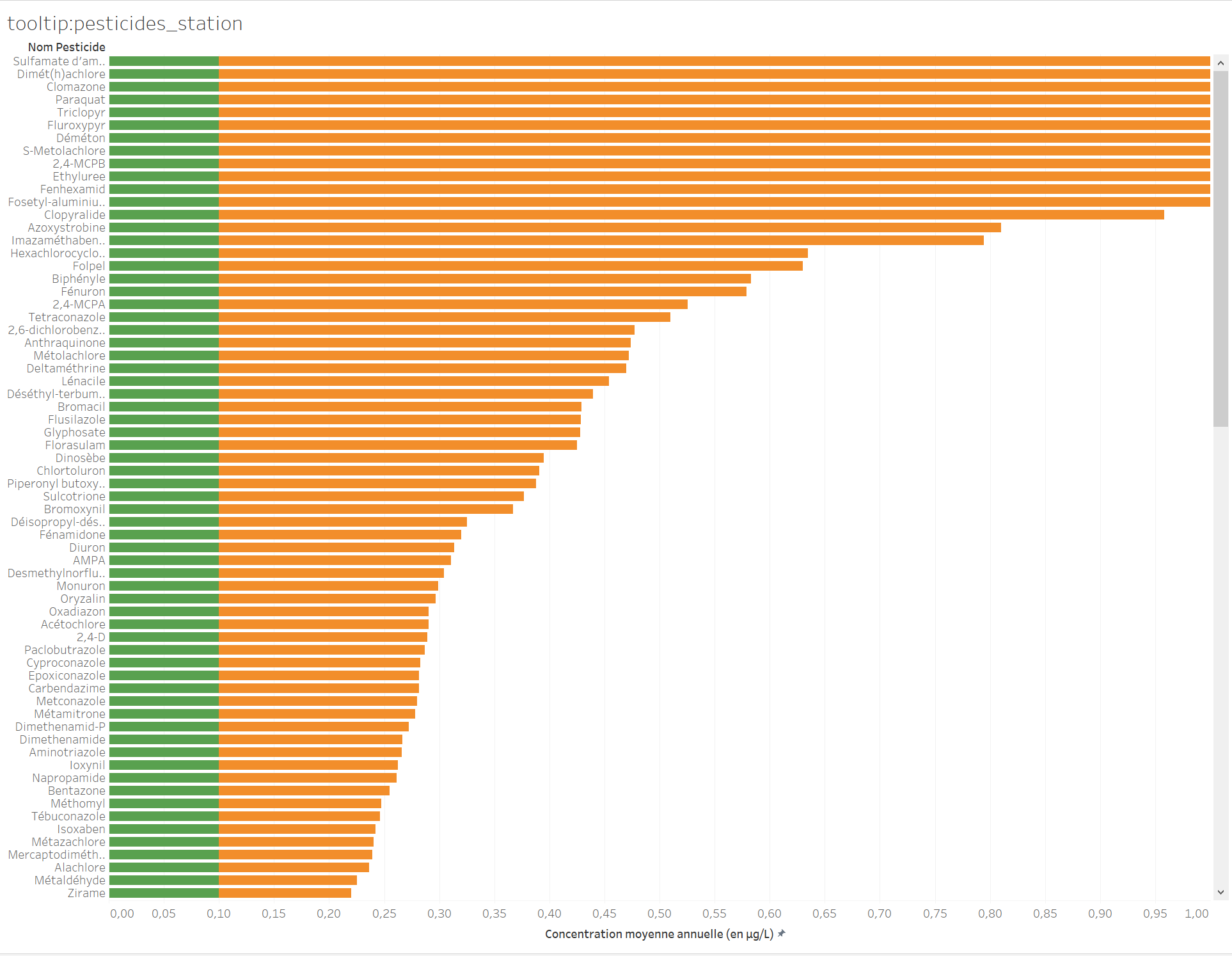
We will be creating a first graph displaying the average concentration in µg/L of pesticides which have been declared non-compliant by distinguishing between the proportion that is under the limit defined by the standard and the proportion that exceeds this limit. The aim is for this graph to be subsequently inserted into a tooltip in the interactive map. This will enable this graph to be dynamically customized per year and per water treatment plant when the user mouses over the map.
Procedure
Start by selecting a new spreadsheet. Given that we have requested the creation of an extract, agree to save the proposed file. There are around 3 million lines to load, which should take less than a minute.
Introduction to the workspace
The current screen features different spaces:
- The event source used for the spreadsheet.
- The list of fields in the event source. These fields may be dimensions (areas of analysis) or measures. By default, these fields are grouped into tables (in our specific case, a table corresponds to a csv file of the source data).
- The space in which your graphic will be created.
- The space in which the dimensions will be dropped in rows or columns. You can use the
Montre-moibutton in the top right-hand corner to change the type of graphic. - The space in which the attributes will be dropped to associate them with a size, shape, tooltip, etc.
- The space in which the attributes will be dropped to create a filter or pagination.

Reorganizing the data
Tableau has no semantic knowledge of the data. It therefore classifies the different table fields as dimensions or measures, according to their format. The result is unsatisfactory. You will need to intervene at the level of the fields of each table to correct the erroneous interpretations by Tableau.
For the dimension tables, you must convert all of the fields that have been interpreted as measures into dimensions, except for the field displayed in italics (named <table_name(total)), which is a field automatically generated by Tableau, and which is a measure (corresponding to the number of records in the table):
- For each of the four dimension tables, select the fields underneath the gray line, except for the field in italics, and by right-clicking, select
Convertir en dimension(Convert to dimension) (see the screenshot for thedim_pesticide.csvtable).
For the facts_prelevements.csv fact table, convert the three fields: annee, pesticide_key and station_key into dimensions (see screenshot). Next, right-click annee and choose Convertir en valeur discrète (Convert to discrete value).
After reorganizing the data,
- the dimension tables should only contain dimension attributes (displayed in blue, above a thin gray line), except for a single measure (displayed in green, and underneath the gray line) generated by Tableau,
- the
facts_prelevements.csvfact table contains dimension attributes and five measures (including one generated by Tableau). See the screenshot.
Implementing the initial elements
Let’s implement the initial elements of our graphic:
- Rename the sheet as:
tooltip:pesticides_plantby double-clickingFeuille1. The choice of name is important in order to find your place larger-scale projects. - Right-click
libelle_pesticideand rename itNom Pesticide. - Double-click
Nom Pesticide; it should be situated on theLignestier (space 4). - Move the
Nom de mesuresfield toCouleurand theValeurs de mesuresfield to theColonnestier. Both of these fields can be found in the list of fields in the event source (space 2), below thefacts_prelevements.csvfact table. They are automatically generated by Tableau and are useful for creating certain types of views involving several measures. - In the
Valeurs de mesuresheet (which is displayed underneath theRepèressheet - space 5), retain only the following measures:concentration_moyenne_inf_norme(average concentration below standard) andconcentration_moyenne_sup_norme(average concentration above standard).
By default, Tableau calculates the sum of all average concentrations. This prompts us to consider the concept of additivity: a concentration cannot be added and can only be averaged.
- For each of the measures in the
Valeurs de mesurefield, click the arrow on the right-hand side of the field and chooseMesures > Moyenne
Let’s choose the most self-explanatory colors: green for the proportion conforming to the standard and orange for the non-compliant proportion.
- Click the
Couleuricon >Modifier les couleurs, and then choose the color of each attribute. - On the right-hand side of your workspace, note that a key shows the correspondence between attributes and colors in the event that the name of the attribute is only partially displayed in your window.
Configuring filters and formatting
So far, we have been seeing all pesticides, whereas we only want to focus on the non-compliant ones.
- Move the
respect_normefield into theFiltresspace and select the optionNon.
The graphic obtained is quite difficult to read because unfortunately, the levels of certain samples are several hundred times above the limit set by the standard. We shall modify the X-axis and limit it to 1µg/L, which will ensure clarity in the vast majority of cases.
- Right-click the X-axis on the
Valeurheading>Modifier l'axe. - Choose
Fixeand an interval between0and1.
The display is somewhat unnatural because we would expect to see firstly the compliant proportion in green, followed by the non-compliant proportion in orange.
- In the
Valeurs de mesurespace, reverse the order of the attributes.
Place the emphasis on the pesticides posing a major problem:
- Click the X-axis to open a small window with three icons; choose
Trier dans l'ordre décroissant(Sort in descending order).
Finally, make sure that you choose a clear title for this X-axis:
- Right-click the X-axis on the heading
Valeur>Modifier l'axe. - At the bottom of the window, change the title of the axis to a clear title with the units used:
Concentration moyenne annuelle (en µg/L).
Overview of the final configuration
